Graphic Design Work
In Carnegie Mellon’s Communication and Digital Design Fundamentals course, I got to explore the concepts of typography, hierarchy, alignment, proximity, color, and more, while learning to use Adobe Illustrator and InDesign and Figma
typography
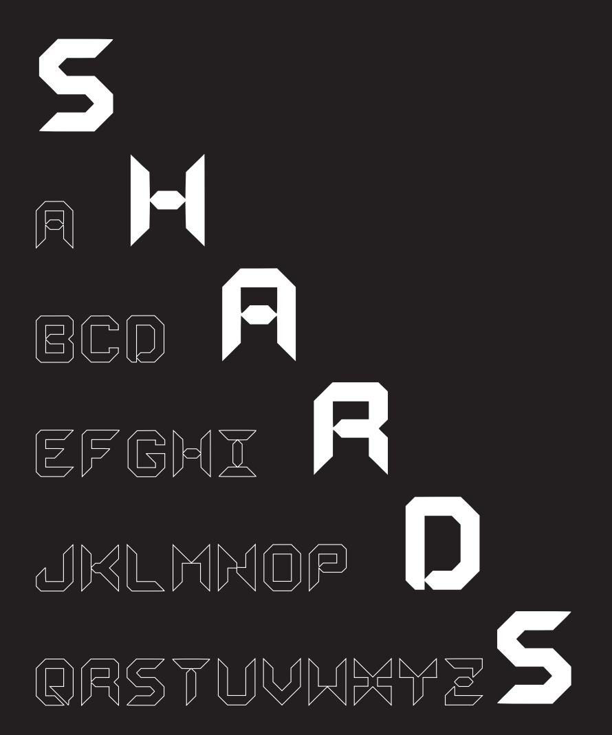
The first exercise challenged us to create our own typeface using either a square or bubble grid, with each letter constructed exclusively from full or half shapes.
I began by sketching eight different concepts for the letters O, M, H, and Y on grid paper. After evaluating the concepts, I recreated the strongest design in Illustrator and expanded the visual language to the rest of the alphabet.
The letters J, K, R, and Z proved to be the most challenging and went through the greatest number of iterations before reaching a cohesive final design.
After refining the letterforms through a series of type tests, I assembled the finalized uppercase alphabet for Shards into a type specimen poster using InDesign.
To learn more about the design process and see additional iterations, check out my blog post.
Recipe Layout
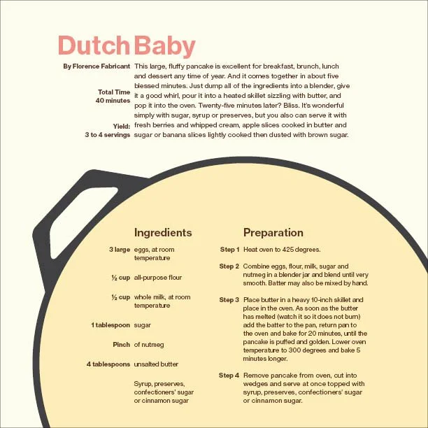
This project explores how typographic layout influences readability, hierarchy, and visual composition through the design of a cookbook recipe spread. The project was created entirely in InDesign.
Starting with only the text from Florence Fabricant's New York Times recipe for a Dutch Baby, I first experimented with varying column widths to establish different layout compositions. I then refined the design by adjusting type size, weight, and emphasis through bold and italic styles. Finally, I incorporated color and geometric shapes to create the finished recipe layout shown here.
Branding Email
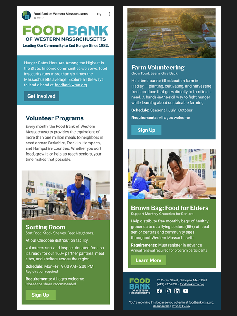
This exercise challenged us to apply the design principles we had learned to an existing brand by creating an email newsletter for a food bank as if they were a real client.
I began by analyzing the Food Bank of Western Massachusetts's existing brand identity, creating a brand sheet that documented its color palette, typography, logos, and other key visual elements to ensure the newsletter aligned with its established style. Next, I developed a series of black-and-white wireframes using only text and grayscale image placeholders to refine the layout and spacing. Once the structure was finalized, I explored multiple iterations of color placement and selected imagery from the organization's website that best complemented the content in each section.
The entire design process was completed in Figma, and the final newsletter is presented as an interactive prototype displayed on an iPhone screen.
Editorial Design
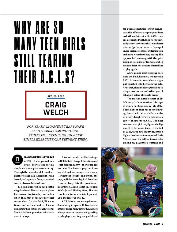
This final project brought together the software skills and design principles explored throughout the course in the creation of a complete editorial layout for both print and mobile reading. The assignment was to redesign an existing news article in the visual style of a different editorial publication.
The article was originally published in The New York Times Magazine. While the text remains unchanged, the layout, typography, and imagery were reimagined in the style of Sports Illustrated.
I began by analyzing a print issue of Sports Illustrated, selecting a feature article whose design language I wanted to emulate. Through this analysis, I identified a 14-column grid system and the primary typefaces used throughout the publication. I then developed a wireframe for the article, carefully refining the text flow to eliminate awkward line breaks and orphaned words. Once the typography and layout were finalized, I selected and incorporated imagery that reinforced the article's narrative.
The print magazine layout was created in InDesign, and the mobile reading experience was designed in Figma to create a responsive, web-friendly version of the story.